
From Developer → UX Team Lead
Building a 0-1 design practice & modernizing clinical workflows
OPIE Anywhere was already being built when I joined.
No designer. No research process. I decided to change that.
Domain: Healthcare B2B SaaS (Orthotics & Prosthetics)
Timeline: 2018-2021, OPIE Anywhere launched 2019
Core Skills: Mixed-methods research, usability testing, clinical compliance, design systems, legacy platform redesign, workflow optimization, technical feasibility analysis
My Role: UX Team Lead & Founding Designer (Originally hired as Front-End Developer)
Team: Product owner, solutions architect, customer success, customer support, engineering, QA
BACKGROUND
About O&P
Orthotics and prosthetics (O&P) is a healthcare field focused on designing, fitting, and delivering custom devices such as prosthetic limbs and orthotic braces to patients with physical disabilities or injuries. OPIE Software is the platform that over 1,700 O&P facilities run on worldwide, supporting the entire patient journey from initial visit and clinical operations through fabrication, billing, and final device delivery.
Objective
For most of OPIE's history, practitioners managed everything from a desktop computer at the office. But patient care happens in hospitals, rehabilitation centers, nursing facilities, and patient homes. An earlier mobile app (OPIE Mobile) existed but offered minimal functionality and was no longer being developed.
OPIE Anywhere was the solution. It needed to be what neither the desktop app nor the mobile app could be: a single responsive platform that worked across mobile, tablet, and desktop, built for how clinicians actually worked, from anywhere.
MY STARTING POINT
From Developer to First UX Designer
I originally joined OPIE as a Front-End Developer on the core engineering team building OPIE Anywhere. The initial directive was a straight 1-to-1 code migration: take the massive legacy desktop architecture and re-platform it to the web as-is, same workflows, same logic, same everything. No UX designer. No research process. No design system.
As a front-end developer writing the production code (React/C# .NET), it quickly became clear that copying the legacy workflow logic as-is could threaten user retention and adoption once the migration shipped. The layouts hadn't been reimagined for mobile, and the workflow logic itself was hard to follow. Leveraging my design background, I began designing workflow improvements and interactive prototypes on my own, and brought them to sprint planning to prove a better path forward.
The Pivot
01 / Developers had designs to build from
Before this, engineering was making design decisions during sprint planning. Having annotated wireframes covering all edge cases changed how sprint planning happened. Developers knew what to build, why it was designed that way, and what states to account for. There were fewer surprises during sprint planning and less rework overall
02 / Design moved ahead of development
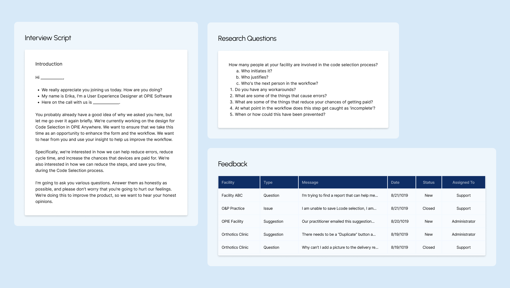
Working one to two sprints ahead, I decided what needed validation before reaching engineering. I reviewed existing user feedback, conducted heuristic evaluations, created flowcharts, and ran usability testing with clinicians. I worked with the Solution Architect and Product Owner to prioritize feature releases and identify new features for OPIE Anywhere. By the time final designs reached development, the team had a shared understanding of the product area.
03 / Became OPIE's First UX Designer
After balancing front-end work and design, I pushed for a dedicated design role and I transitioned into the company's first UX Designer. I immersed myself in UX design and the design thinking process. UX was the intersection between design and technology I had been looking for, applied to real problems clinicians faced every day. More importantly, this shift proved that what I was saying mattered, and that design isn't just about making things look pretty. To me, it was about making the software actually work and making the jobs of clinicians much easier so they don't have to struggle with the tools and can focus entirely on patient care.
CONSTRAINTS
Challenges
Designing across every device
OPIE had never had a responsive product in its 25-year history. I defined breakpoints using analytics data from across the platform to understand what devices users were actually on, then selected standard breakpoints covering the widest range, including international users on smaller screens. The app was also built as both a web app and an App Store download, meaning every design had to hold up across mobile browser, native app, tablet, and desktop.
Mobile first for a form & table-heavy platform
Practitioners needed to work from their phones in the field, but the platform was built around complex clinical forms and dense data tables. I used NNG usability heuristics and competitive analysis to break long forms into stepped wizards, collapse sections, prioritize fields, and size touch targets for mobile. For patient intake, I designed a sectioned wizard with the goal that it could eventually be handed directly to patients on an iPad.
Building a system from the start
Coming from graphic design, building with consistency came naturally. I built reusable components knowing that patterns from one form would carry directly into another form. I addressed color contrast and accessibility early because the existing brand palette was print focused and didn't meet web accessibility standards.
Learning and mapping as I went
O&P has its own terminology, workflows, and compliance requirements. I was learning the domain while designing for it, validating every assumption through user feedback or internal experts. I established personas and began mapping the patient journey early, but the full picture was assembled piece by piece alongside the design work.
THE USERS
Understanding the Users
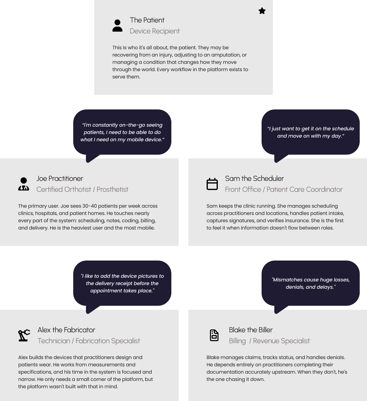
Before jumping to design, I needed to understand how an O&P clinic actually operated. I spent time at our CEO's clinic shadowing staff and asking questions. I focused on understanding who worked there, what their roles were, what they were responsible for, how they used the system, and who they communicated with throughout the day. Each step in the patient journey involved a different role with different needs, different devices, and different expectations of the software.
I developed personas early, starting with the roles closest to the first workflow area I would be designing. The 5 personas identified early in my research:
A CLOSER LOOK
A billing workflow that directly affects patient care.
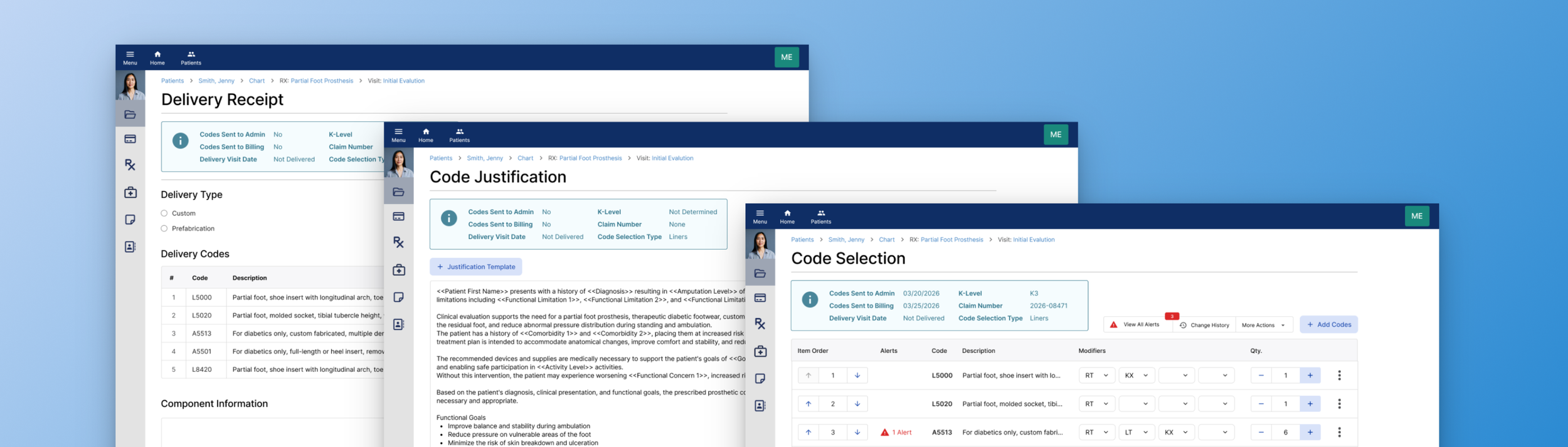
In O&P, getting a patient their device requires more than delivering it. A practitioner must select the correct billing codes, justify each one for insurance compliance, deliver the device, capture a patient signature, and initiate a claim.
The Challenge
The software wasn't making the right action obvious at each step. A missed justification delays authorization. An incomplete delivery receipt delays billing. A billing delay means a patient waits longer for the care they need.
Billing Workflow
→ Select the correct billing codes → Justify each for insurance compliance → Deliver the device → Capture patient signature → Initiate a claim →
Code Selection
Every insurance claim starts with code selection. Practitioners must identify the correct billing codes for a patient's prescribed device. But the search was so difficult to navigate that practitioners kept physical handouts of keywords just to use it. And when alerts appeared, resolving them meant navigating away, losing context, and making errors.
"We even make our own training videos to teach the workarounds."
— Practitioner, multi-office prosthetics & orthotics facility
Code Justification
Before a claim moves forward, every code must be "justified" in writing: documented proof that each device component is medically necessary for that specific patient. The software had a template feature for this. It was so tedious to set up that some practitioners stopped using it and maintained their own Word documents on SharePoint instead.
"Setting up templates is a tedious process. I can see it being a pain for people starting out, this could be a reason not to use the feature."
— Practice manager and practitioner, multi-office prosthetics facility
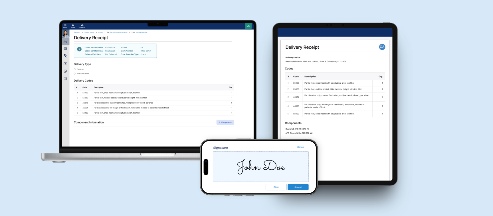
Delivery Receipt
Every device delivery must be formally documented and acknowledged by the patient before a claim can move to insurance. But the form was desktop-only. Practitioners in the field were remoting into their office computers just to complete it. And when they got there, they had no way to know which codes had already been sent to billing. Getting it wrong meant rework, resubmission, and a patient waiting longer.
“When software tries to do everything, it gets too complicated. The less I have to do, the better.”
— Practitioner and business owner, multi-location practice
KEY DESIGN DECISIONS
Alerts needed actions, not just information
When selecting billing codes, the system checks for potential issues: codes that conflict, codes that require companions, codes with limited coverage.
The risks: compliance audits, denied claims, and rework after submission.
Before
All alerts collected in a single modal, disconnected from the codes that triggered them. Practitioners had to close the modal, remember the required action, navigate back, and resolve it manually for every alert. Practitioners learned to ignore the alerts and not open the modal. When a new alert appeared alongside familiar ones, it went unnoticed.
After
Each alert surfaced inline with the code that triggered it, making it immediately recognizable and diagnosable. Distinct icons communicate alert type at a glance. Resolution available directly within the alert. Add or remove a code without navigating away or losing context.
Templates needed automation, not manual steps
Before a claim can be submitted, every billing code must be justified in writing, documented proof that each device component is medically necessary for that specific patient. Practitioners used templates for this, but every dynamic tag inside them had to be manually translated before the justification was complete.
The risks: every manual click was an opportunity for an error that affected reimbursement.
Before
Tag translation required many manual clicks per code, every time. With multiple codes per patient, this added up quickly. The form offered no shortcut. Each code required the same two clicks, every time.
After
One action for all codes. Tags translated simultaneously across the entire justification form.
Practitioners needed visibility, not guesswork.
When creating a delivery receipt or reviewing a code selection, practitioners needed to know the current status of that claim. Whether codes had been sent to admin, sent to billing, what the claim number was, and when the device had been delivered were all critical to making the right decision at each step.
The risks : duplicate billing, administrative errors, and compliance violations caused by not having full picture.
Before
Status information existed but lived elsewhere in the system. Practitioners had to navigate away from the form they were in the middle of completing to check whether codes had been sent to admin, what the claim number was, or when the device had been delivered. Mid-task navigation broke context and created errors.
After
Six critical status fields surfaced directly into the form: Codes Sent to Admin, Codes Sent to Billing, K-Level, Claim Number, Delivery Visit Date, and Code Selection Type. Available at a glance, without leaving the form. The same status bubble carried through to the Delivery Receipt, the same information available wherever practitioners needed it.
OUTCOME
By the time I left, OPIE had a shipped product and a design practice
Clinical workflows moved from the office to wherever care happened
OPIE Anywhere launched in 2019, not as a 1-to-1 port of the legacy desktop system, but as a clinical workflow experience redesigned for point-of-care use. Existing workflows were redesigned from the ground up, including the ability to link an appointment inline without leaving the form. New features like delivering codes on the same visit and designating who was signing on behalf of a patient were built directly from what practitioners told us was missing. Code selection, justification, delivery receipt, patient signature: all of it available on any device, wherever care was happening.
Practitioners could focus on patients, not software
The goal was to make the interface invisible, so practitioners could focus on what they came to do: deliver patient care.
Alerts surfaced inline so practitioners could act without losing context. Tag translation became one action across the entire form. Status information appeared directly where practitioners needed it. Workflows that once required training videos and physical handouts worked without them.
Design went from a missing function to an organizational mindset
When I joined there was no design function, no shared language for design decisions, and no process for involving users in product direction. By the time I left that had changed fundamentally.
Engineers building from a shared component library, design working 1-2 sprints ahead of development, other departments asking for UX involvement in their workflows. I hired and onboarded two junior designers into a practice that already had structure, language, and precedent.
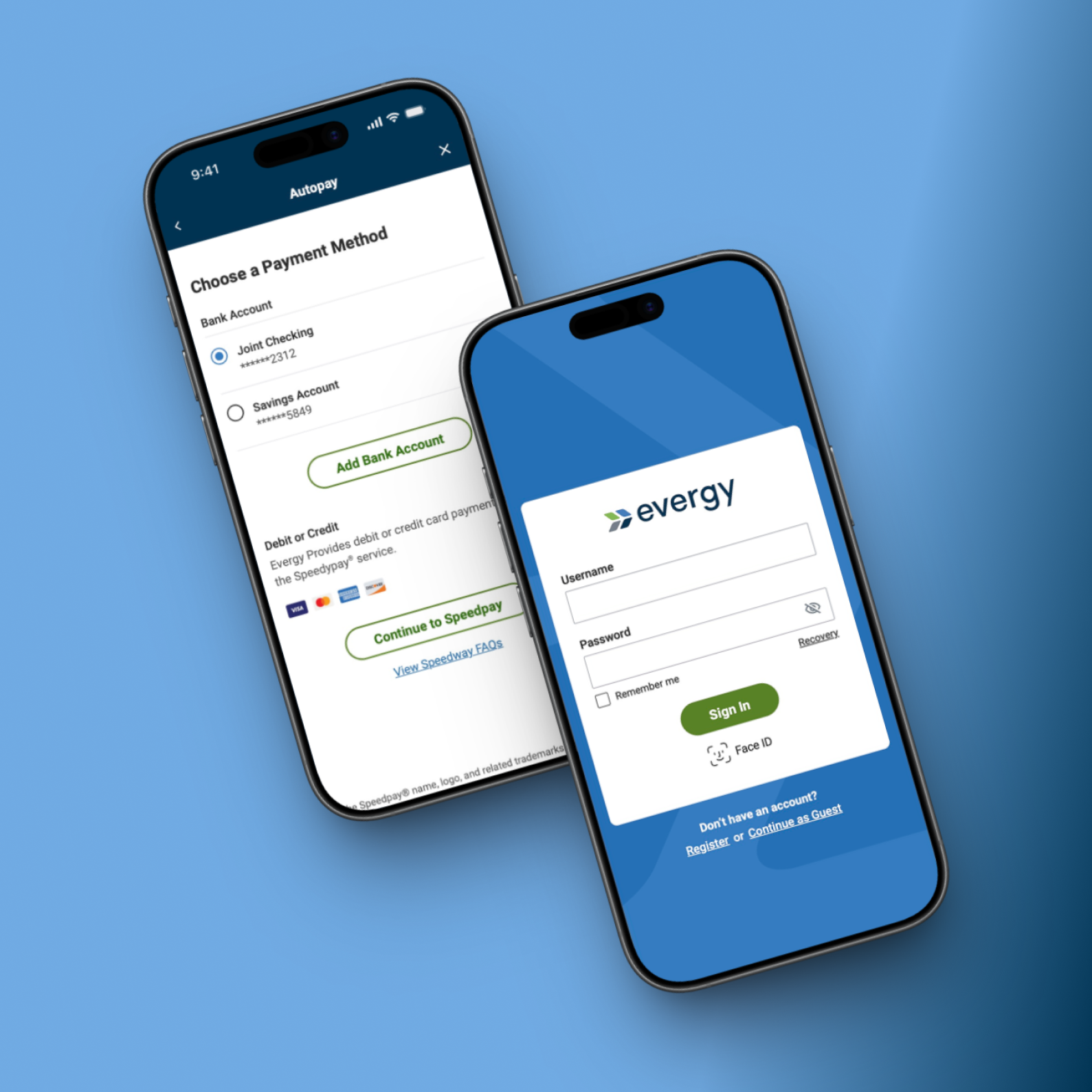
More Work
Designing a scalable native utility platform supporting multi-account management, billing, outage reporting, and high volume self-service workflows critical to payments and service continuity.
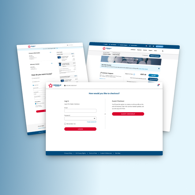
Redesigning a multi-step, service-based checkout to clarify scheduling, pricing, and order details, reducing friction and increasing user confidence at purchase.