
Evergy Native Mobile App Design
Evergy serves 1.7M residential and commercial customers across the Midwest, customers who increasingly expected to manage their accounts from a phone. That's where the existing app fell short.
Domain: Electric Utility, B2C + B2B
Timeline: 8 month design, 2021–2022 (Evergy App launched in early 2023)
Skills: Web + Mobile Integration • Multi-User& Multi-Account System • Systems Thinking • Information Architecture • Interaction Design
Team: UX, Solutions architect, engineering, business analysts, project manager, client stakeholders
Problem
Evergy's legacy mobile app was effectively unusable. It lacked core features and was inconsistent with the web platform. Hundreds of thousands of residential and commercial customers had no reliable way to pay bills, report outages, or manage their accounts on mobile, forcing them to use desktop or call support for time-sensitive tasks.
Overview
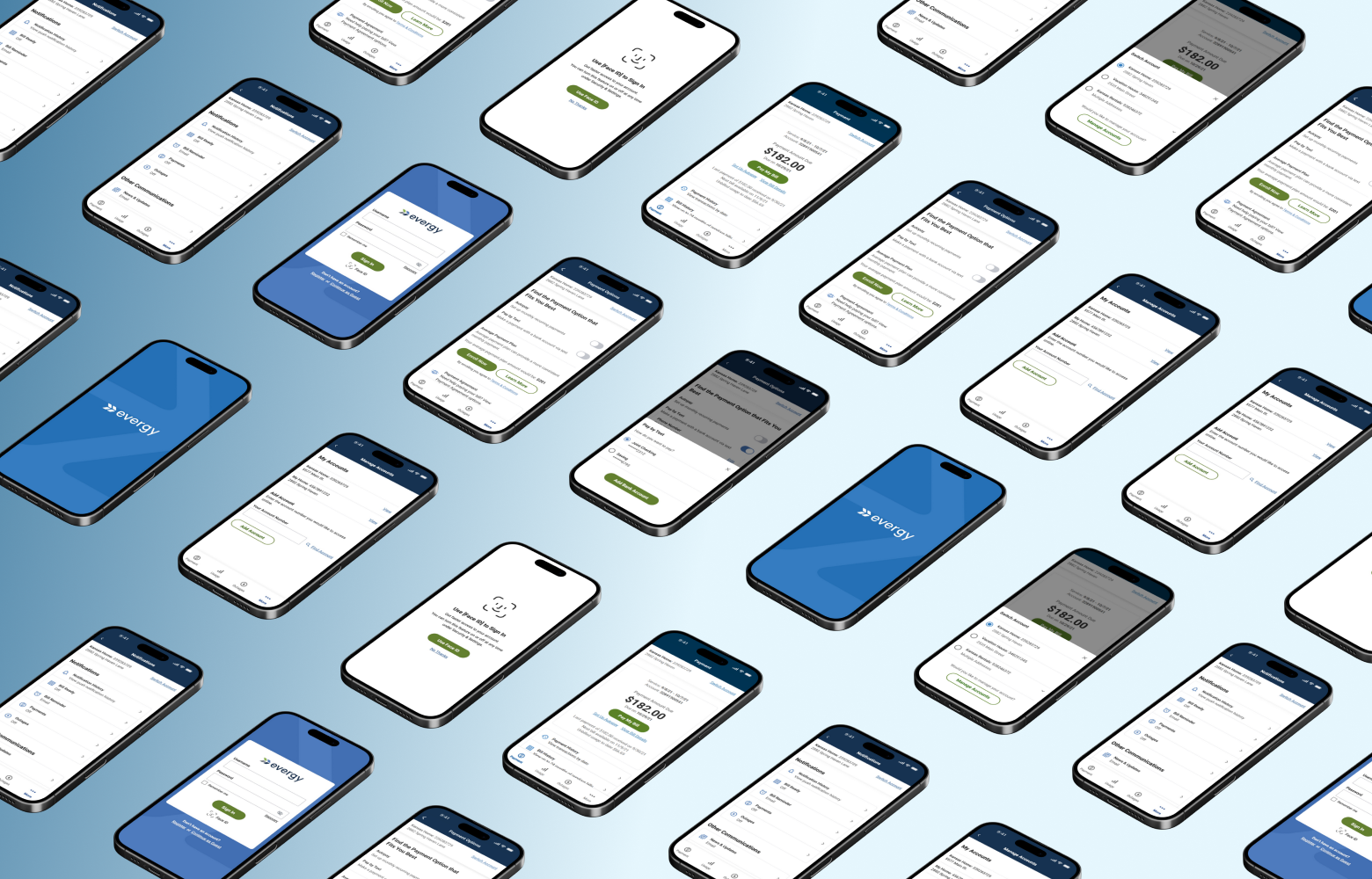
Idesigned a new native mobile app from the ground up,owning the process end-to-end from stakeholder alignment on key launch features to information architecture and interaction design. The solution had to scale across account types, handle guest and authenticated states, and integrate hybrid web components without breaking mobile clarity or consistency.
My Role
Sole designer, full ownership
I owned the full scope of the project from early discovery through implementation. I defined every pattern, flow, and interaction with no prior mobile foundation to build on.
Reimagined web to mobile-first
I had to redefine an established web ecosystem into a native mobile experience, rethinking structure, navigation, and interaction patterns to fit mobile-first behavior without losing platform consistency and familiarity.
Final design authority
I held final design authority across all UX decisions, working closely with the Solutions Architect to validate logic early and regularly presenting to Evergy stakeholders to maintain alignment throughout the engagement.
Outcome
The app launched as a production-ready experience that supported every core feature aligned on for release, giving Evergy a scalable mobile foundation, and customers a reliable way to manage their accounts, pay bills, report outages, and track usage independently.
Expanded payment capabilities
Introduced multiple payment options and the ability to securely save payment methods, increasing flexibility and reducing reliance on web or support channels.
Introduced scalable account context switching
Enabled multi-account and multi-property users to clearly view, manage, and transact within the correct account, reducing confusion and preventing errors.
Launched outage reporting for guest and authenticated users
Introduced mobile outage reporting with real-time status tracking and SMS notifications, with a consistent experience across guest and authenticated states and account-aware pre-fill that reduced input friction for authenticated users.
Made energy usage insights a core feature
Launched usage insights, enabling customers to understand and track energy consumption, supporting Evergy's goals around conservation and awareness.
Challenges & Constraints
No mobile foundation to build from.
The legacy app offered little to no functionality with no existing patterns, navigation models, or interaction logic to reference. I made the deliberate call to break key flows into mobile-first patterns rather than port the web experience directly, reducing cognitive overload and simplifying task completion.
A complex, multi-user account structure.
The legacy app had no account switching, users had to log out and back in to access different accounts, creating real risk of paying the wrong bill or making unintended changes. I designed a scalable context selector that made the active account unmistakably clear, with visibility rules and downstream behavior that adapted correctly across every screen and flow.
Hybrid web and native dependencies.
Bill payment, outage reporting, and specific payment types relied on embedded web components. I designed each hybrid touchpoint to feel contained and purposeful, ensuring users were returned to the native flow on completion without feeling like they had left the app.
Platform-specific mobile behavior.
I made deliberate decisions about when to use native conventions versus material design patterns to maintain consistency across platforms. For example, notification setup used native mobile (iOS/Android) dropdowns while other interactions used material design, which required clear consistency rules to avoid a fragmented experience.
Guest and authenticated state complexity.
The business required guest access for high-priority tasks such as bill payment and outage reporting. Inconsistent behavior between the two states could create confusion or limit task completion in high-stakes moments. I designed each flow to maintain structural consistency, with more effective state-aware flows for authenticated users.
My Approach

Define scope with stakeholders before design
I began by auditing the web experience and aligning with stakeholders on which core features were required for launch. Establishing this shared understanding early ensured the IA and flows could be built around validated business priorities, rather than iterating later.
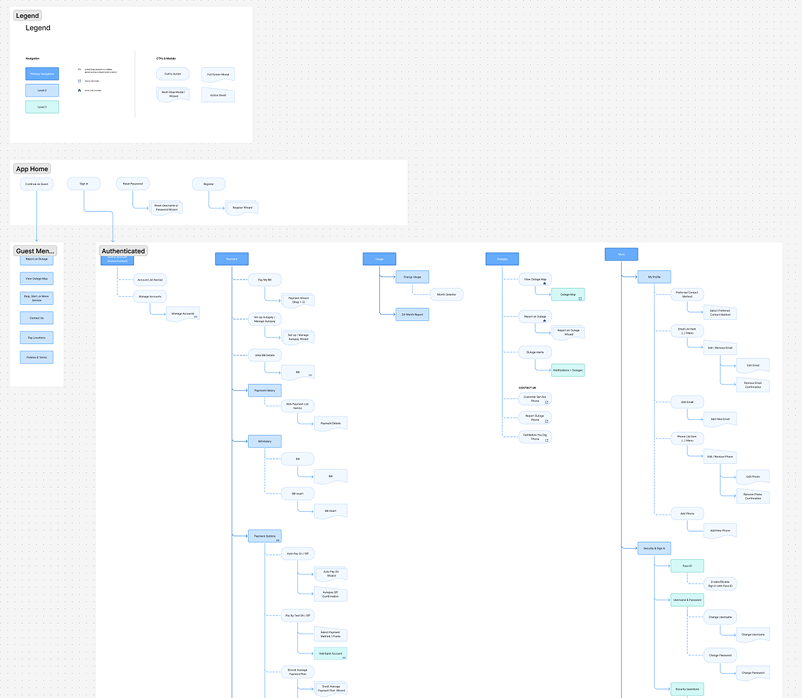
Establish information architecture before screens
Rather than jump into visual design, I prioritized building a clear sitemap and IA that the entire team could align around. With multiple account types, hybrid components, and varying permissions, getting the structure right early meant the rest of the project could move with confidence and fewer revisions.
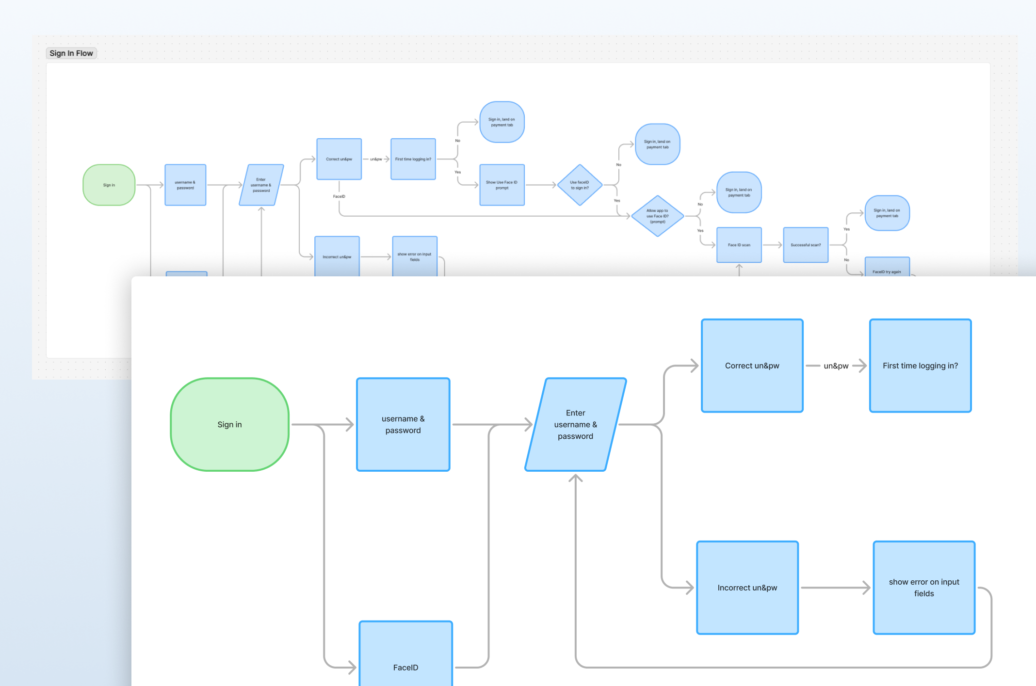
Validate flow logic early & often with engineering
I created detailed flowcharts mapping behavior across payment methods, hybrid components, and permission states, and reviewed them with the Solutions Architect to surface technical constraints and dependencies. This reduced uncertainty and prevented rework.
Key Design Decisions
Defining primary navigation priorities
With no legacy structure to reference and multiple competing priorities, I had to determine what earned primary navigation versus what lived in secondary menus. I established a four tab structure: Payments, Usage, Outages, and More, balancing user frequency, stakeholder priorities, and urgent access needs. Everything else (account settings, payment methods, notifications, and support) was grouped under More, keeping cognitive load low while maintaining full feature access. I validated the structure with the Solutions Architect to ensure technical feasibility and data dependencies could support this organization.
Designing a scalable account context selector
With users ranging from single residential accounts to commercial users managing 15+ addresses across multiple accounts, the selector had to scale across a wide range of states without losing clarity. I made it persistent under the title bar so users always knew which account they were viewing, with defined visibility rules that hid it during mid-flow states like payment, where an accidental switch could cause errors. Every account and address combination required its own documented state, making this one of the most structurally complex decisions in the project.
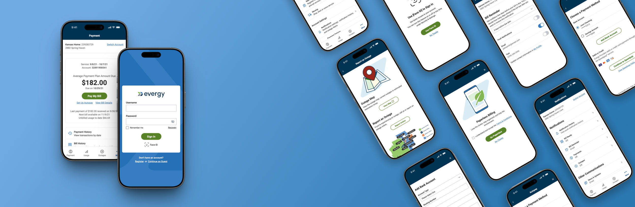
Designing an end-to-end mobile payment experience
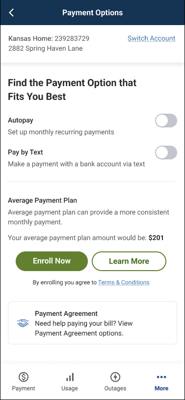

The payment flow was the most complex in the project due to the range of payment options that had to be supported: bank accounts, debit and credit cards, AutoPay, Pay by Text, and payment assistance programs, each with its own logic, validation rules, and error states. I broke each flow into smaller, mobile-first steps to reduce cognitive load while maintaining consistency with the web experience. If users didn’t have a saved payment method mid-flow, I designed in-flow paths to add one without losing progress. Validation was built into each step with clear, actionable error states ensuring users couldn't complete a payment with invalid information.
Unifying guest and authenticated outage reporting
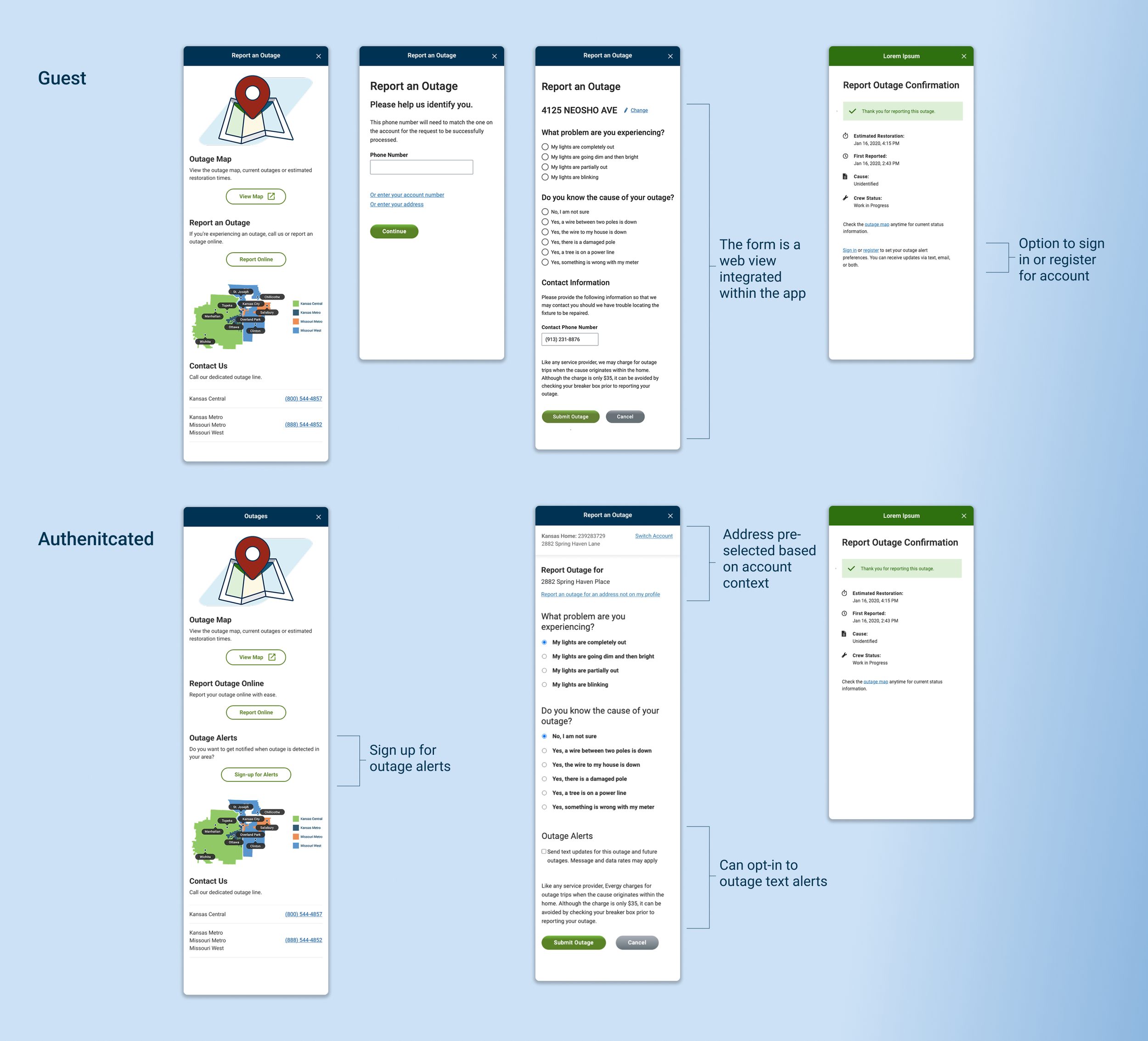
Stakeholders prioritized guest access to ensure customers could report outages during emergencies without login friction. The challenge was making the experience feel mobile-first while integrating the web-based outage map and screens. I hid the web header and footer and used consistent mobile patterns to maintain a native feel. For authenticated users, I leveraged the account context selector to prefill address and account information while allowing users to switch addresses or report for locations not on their profile. Both guest and authenticated users could track outage status through the integrated map.
Results & Impact
Enabled self-service for high-frequency tasks
The app launched as a production-ready experience supporting bill payment, account management, outage reporting, and usage tracking. Multiple payment options and guest access reduced friction for Evergy's highest-volume transactions, shifting customers from web and phone support to mobile self-service.
Made multi-account management possible at scale
The persistent account context selector enabled users to manage everything from single residential accounts to commercial accounts with 15+ addresses, ensuring users always knew which account they were acting on and preventing errors like paying the wrong bill or reporting an outage to the wrong address.
Created a scalable foundation for planned expansion
The IA and navigation model supports Evergy's roadmap for expanding usage insights and eventually eliminating web integration, enabling future capabilities without requiring structural rework.
More Work →
Joined as a developer, became the first UX designer, and redesigned 20+ clinical workflow areas for a point-of-care healthcare platform serving 1,700+ orthotics and prosthetics practices worldwide.
Redesigning a multi-step, service-based checkout to clarify scheduling, pricing, and order details, reducing friction and increasing user confidence at purchase.