
Redesigning Checkout for a Service-Based Product
Republic Services serves approximately 13 million customers across North America. Customers needed a checkout experience that clearly communicated pricing, service availability, and order details because the lack of transparency was creating friction and driving abandonment.
Domain: Electric Utility, B2B2C
Timeline: 2 month design, 2022
Skills: Service-based commerce, high-volume transactions, multi-step workflow, checkout optimization, pricing transparency, progressive disclosure, guest user experience
Team: Project manager, solution architect, business analyst, client stakeholders, client developers
Problem
The checkout experience introduced friction through unclear order and scheduling details and excessive upfront data collection, contributing to drop-off and abandonment.
Key issues included:
Too much information required upfront, increasing friction and drop-off
Service selection, schedules, and order details were unclear
Pricing lacked transparency, making it difficult to understand what contributed to the total
Users lacked clarity on why required information was being collected
Payment and delivery contacts were not clearly distinguished (who's paying vs. who's receiving the service)
Solution
To reduce checkout friction and abandonment, I worked with stakeholders to reevaluate what information was truly required upfront vs. what could be collected later. The strategy centered on progressive disclosure, pricing transparency, and clarifying services so users can complete checkout with confidence.
Key Design Decisions
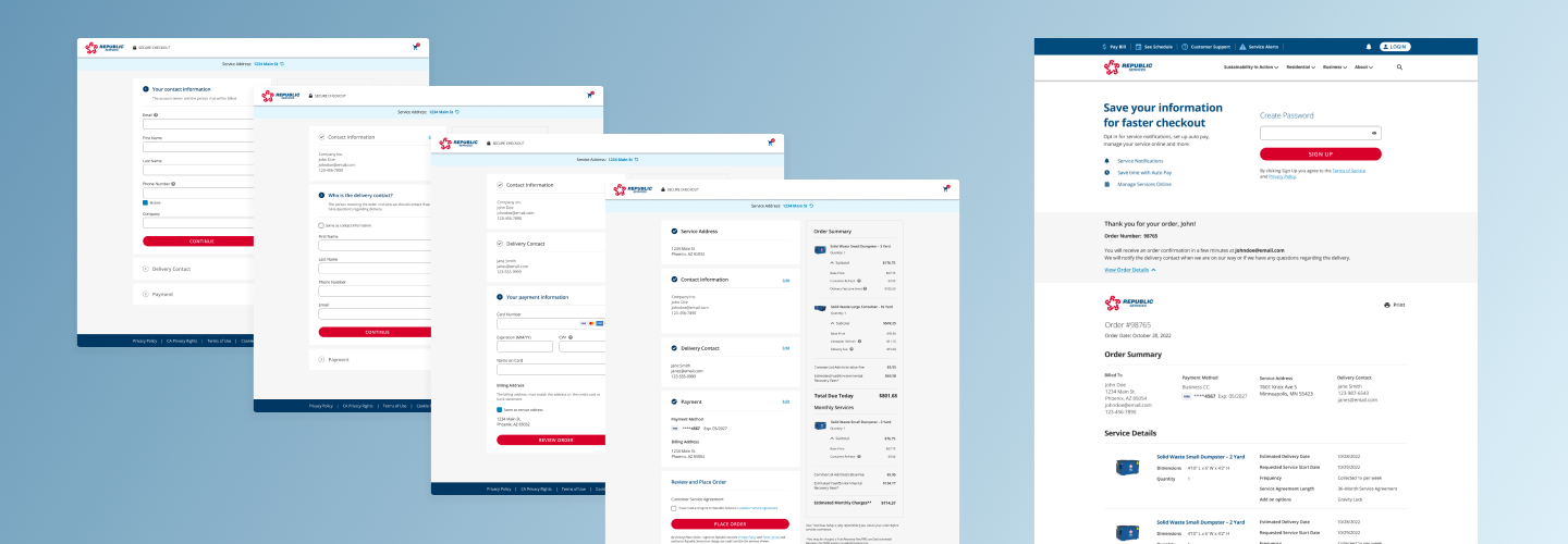
Reduced Upfront Data Collection
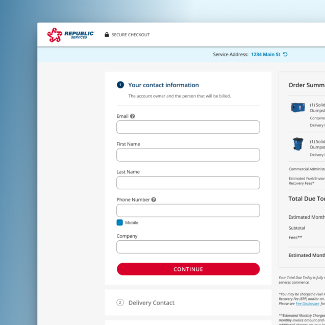
Aligned with stakeholders to defer non-essential fields like service preferences, account details, and communication settings. The strategy was to keep checkout focused on what was essential to deliver the service (service and address, contact information, delivery contact, and payment), everything else could wait until after purchase. The tradeoff was intentional: reduce form length and prioritize speed to purchase over upfront data collection, getting customers through checkout faster so we could capture additional information once they were already customers.
Service, Scheduling, and Pricing Clarity
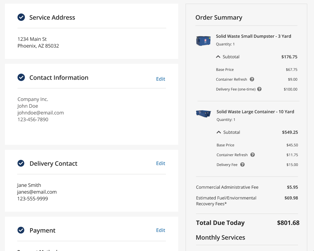
I broke down all costs with collapsible sections showing individual line items (base price, delivery fee, etc.), each with informational tooltips describing what the fee was and why it applied. I labeled one-time charges explicitly so it was clear to users. For recurring services, I created a separate section with visual separation between upfront costs and recurring monthly charges. The goal was transparency about pricing so users felt comfortable with the costs, increasing their likelihood of completing their purchase.
Distinguishing Account and Delivery Contacts
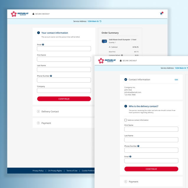
Business customers would often have an employee be on-site to receive the delivery of the service, so we had to capture contact information of the account holder and the delivery contact. I added descriptive text so users clearly understood what information needed to be filled out ("Account owner and person to be billed" vs. "Person receiving the order"), preventing confusion about who would be contacted about delivery and who would receive notifications about the account. I also included an option to auto-fill the delivery contact info as the same as the payment contact, reducing friction for when it was the same person.
Progressive Order Review
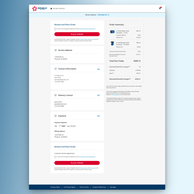
I used a vertical wizard layout that collapsed each section as users completed it, keeping all previous information visible on screen. This design allowed users to review and edit any section without stepping backward through the entire flow, a key advantage over traditional horizontal wizards where previous information disappears from view. By the time users reached the final step, all sections (contact information, delivery contact, payment information, order summary) were visible, giving users a final opportunity to review before purchase, reducing hesitation and submission errors.
Post-Purchase Account Creation For Guest Users
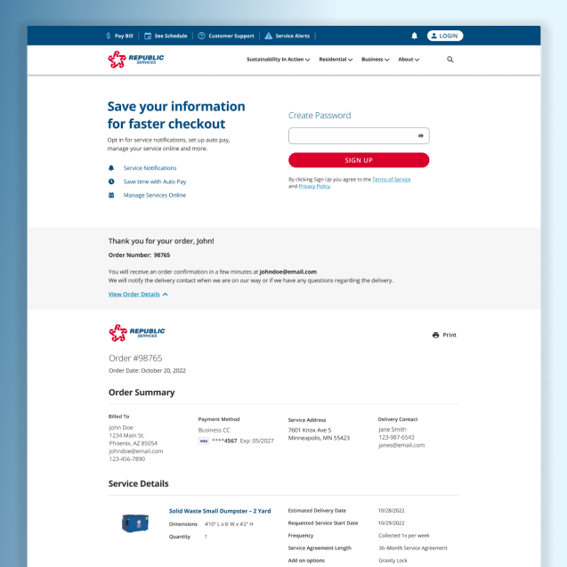
Account creation was important to the business, so we wanted to offer users completing checkout as guests an opportunity to create one. Since we had already captured all the information needed post-purchase, I introduced a simple, optional field: create a password. To encourage users, I displayed reasons to create an account such as faster future checkout, ability to receive service notifications, set up autopay, and manage services online. This low-friction option converted one-time buyers into account holders without interrupting the purchase flow, and the incentives gave users a reason to complete the step.
Outcome
The redesigned checkout experience was approved through stakeholder review and successfully implemented. The final solution launched on the Republic Services website, delivering a clearer, lower-friction purchase path for a complex service-based product with millions of residential and commercial users.
Reflection
This project reinforced the importance of progressive disclosure and pricing transparency in service-based checkout flows, where trust and clarity directly impact completion. Aligning stakeholders around reducing upfront requirements helped create a smoother path to purchase without sacrificing necessary information.
More Work →
Designing a scalable native utility platform supporting multi-account management, billing, outage reporting, and high volume self-service workflows critical to payments and service continuity.
Joined as a developer, became the first UX designer, and redesigned 20+ clinical workflow areas for a point-of-care healthcare platform serving 1,700+ orthotics and prosthetics practices worldwide.