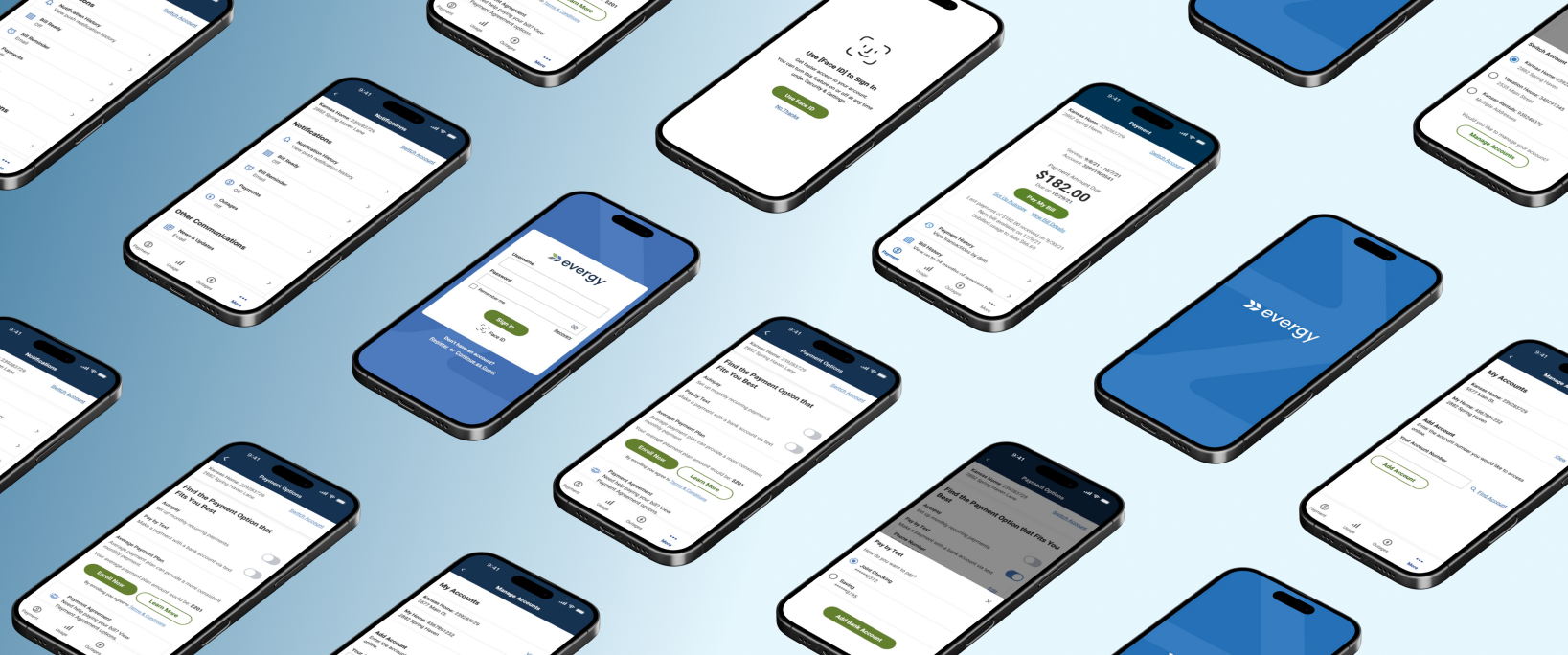
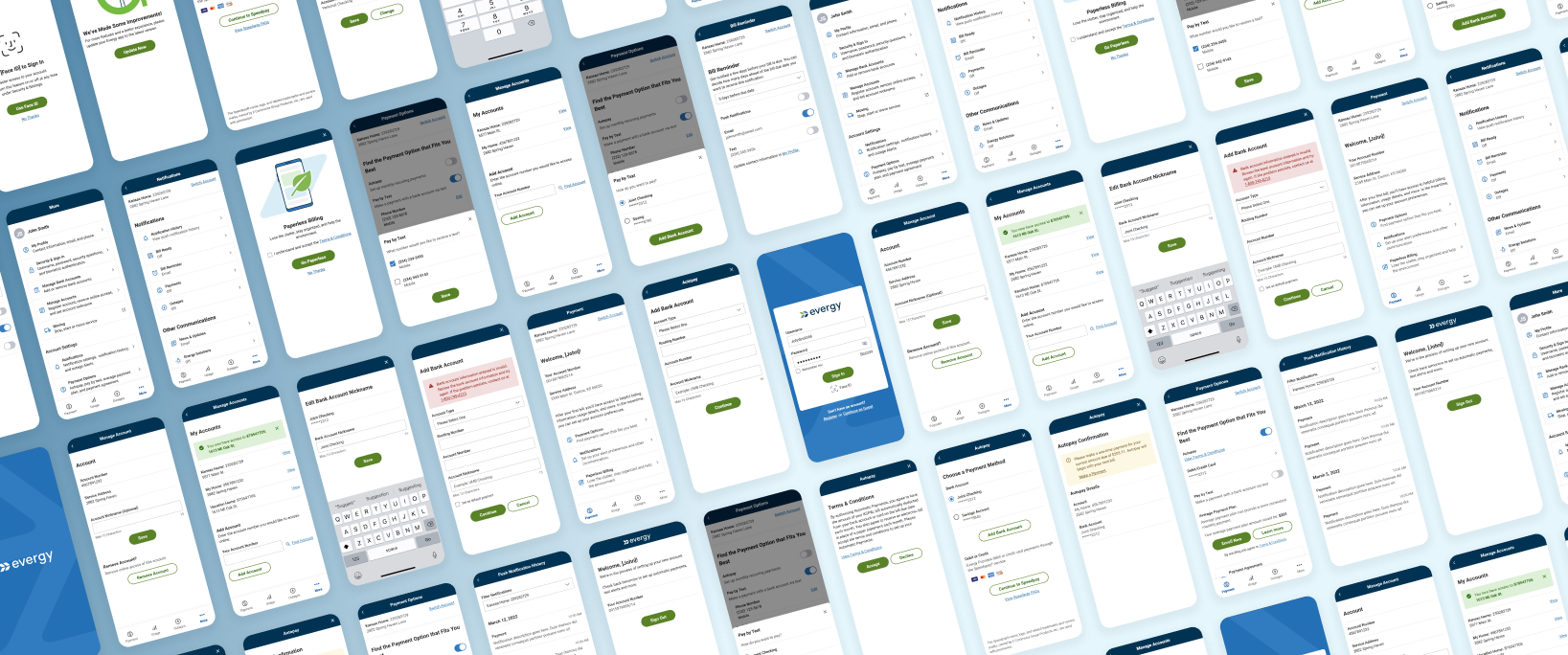
Evergy Mobile App
End-to-end mobile app design focused on system clarity, scalability, and self-service outcomes.
Project Type: Mobile App Design
Role: UX Lead
Timeline: 8 month design
Team: UX · Solutions Architect · Business Analyst · Developers · Project Manager · Client Stakeholders
Overview
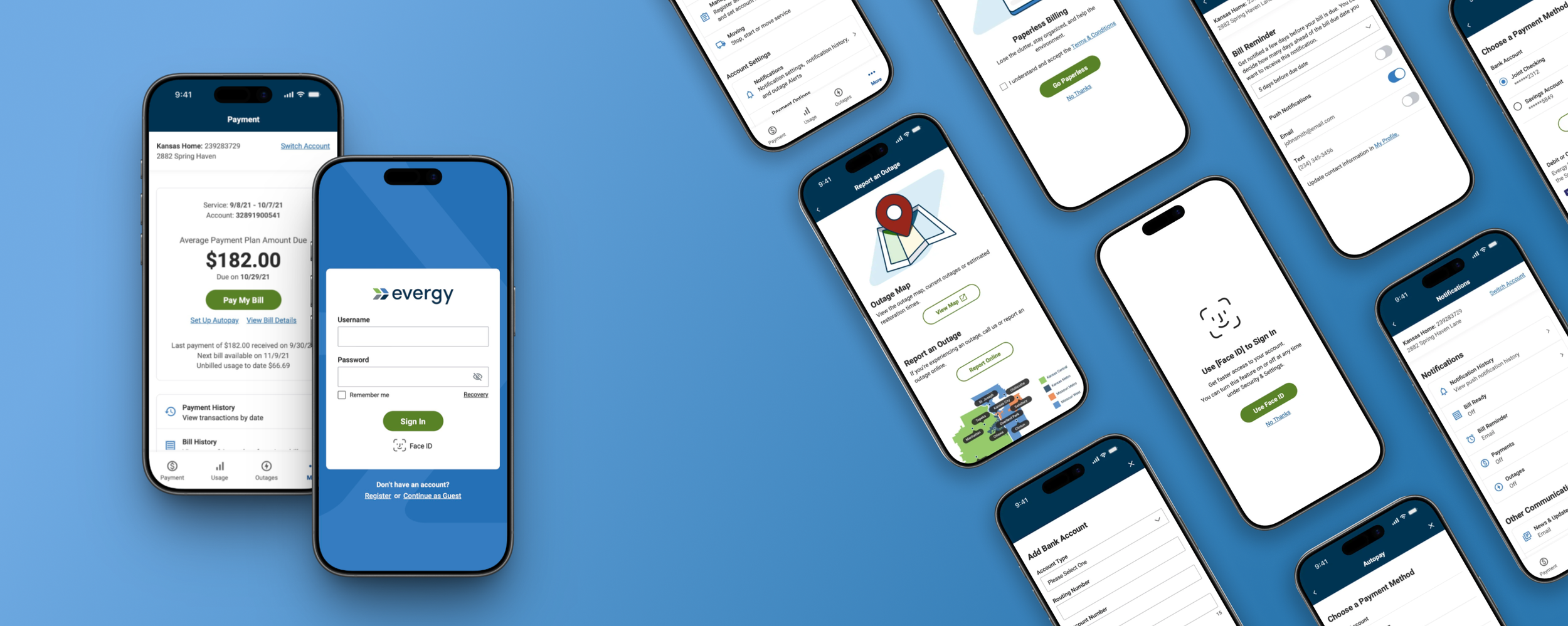
Evergy’s existing mobile app was outdated, limited, and inconsistent with its web ecosystem. The goal was to design a new, fully native mobile experience that aligned with the broader web platform and supported high-frequency tasks such as bill payment, outage reporting, usage tracking, and multi-account management with greater clarity and ease.
My role
I led the end-to-end UX process for the new mobile app. This included defining the information architecture, mapping complex flows, designing all screens and interactions, and ensuring that every decision aligned with both technical constraints and user needs. I partnered closely with the Solutions Architect, developers, and stakeholders to validate logic, maintain alignment, and ensure the final experience was feasible and consistent.
Outcome
The project delivered a cohesive and scalable mobile experience that supported every core feature we aligned on for launch. By simplifying the most complex workflows, the app encouraged more customers to complete tasks independently and gave Evergy a foundation that can continue to evolve across both mobile and web.
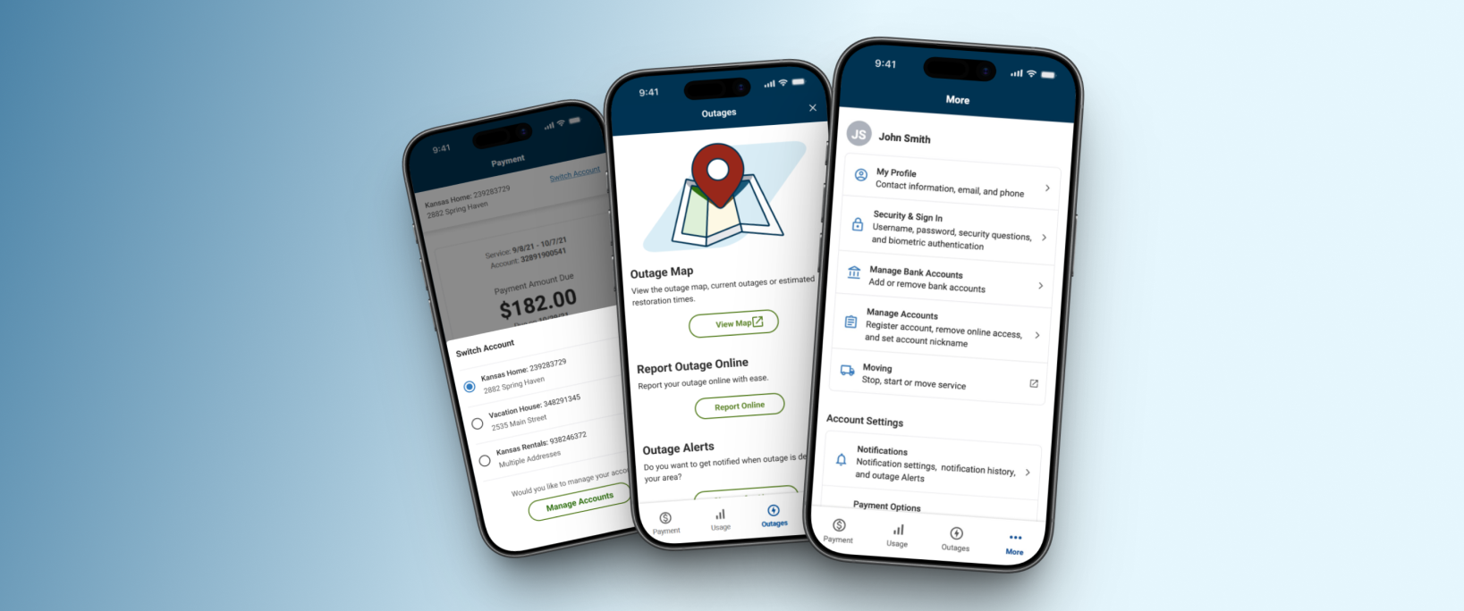
Bill payment became easier and more flexible, supporting multiple payment methods with fewer points of friction
Multi-account users gained a clear, predictable way to switch contexts, reducing confusion for residential and commercial users
Outage reporting became faster, clearer, and consistent, supporting both guest and authenticated users
Usage insights became more accessible, helping customers understand energy patterns with confidence
Mobile and web remained aligned, ensuring consistency across Evergy’s broader ecosystem
Challenges & Constraints
The project required navigating several constraints that shaped how the app needed to function. I had to design a completely new native app that aligned with a large web ecosystem, supported multiple user types with varying account structures, and incorporated hybrid system behavior. Establishing a clear and scalable structure early was essential because the sitemap and flow logic would guide everything that followed.
Core experiences, including bill payment, relied on embedded web components, which required smooth transitions between native and web flows.
Web to app dependencies
Residential, multi-property, and business users all needed a navigation model that scaled cleanly and maintained clear context.
Multi-account support
Flows such as bill payment and outage reporting had to support both guest and signed-in users, each with different states, inputs, and system logic.
Guest vs. authenticated flows
Platform-specific behaviors such as biometrics and notifications needed to be accounted for to ensure consistent interaction patterns across iOS and Android.
Mobile interactions
My approach
My approach centered around creating clarity and alignment before moving into design: understanding the existing ecosystem, structuring it in a way that made sense, and validating feasibility with engineering and stakeholders at every step.

1. Establishing clarity & alignment
I began by auditing Evergy’s web experience and aligning with stakeholders on core features required for launch. This early clarity ensured the app’s structure supported business goals, user needs, and Evergy’s vision for self-service, accessibility, and engagement.
This phase accomplished:
Validated feature priorities and core user needs with stakeholders
Identified key flows required for launch
Clarified user types and their differing needs
Identified technical constraints and system dependencies early
Created alignment across product, engineering, and stakeholders
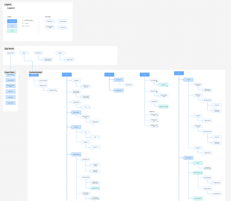
2. Defining the app’s navigation model & IA
The sitemap was the most challenging and rewarding part of the project. With multiple account types, hybrid interactions, and varying permissions, the IA needed to create a clear, scalable structure the whole team could align around. Getting this right early meant the rest of the project could move quickly and with confidence.
This phase accomplished:
Created a scalable navigation model for all user types
Defined predictable pathways across all core tasks
Identified hybrid components early for smoother integration
Clarified flow relationships driven by account context switching
Set the foundation for future feature growth
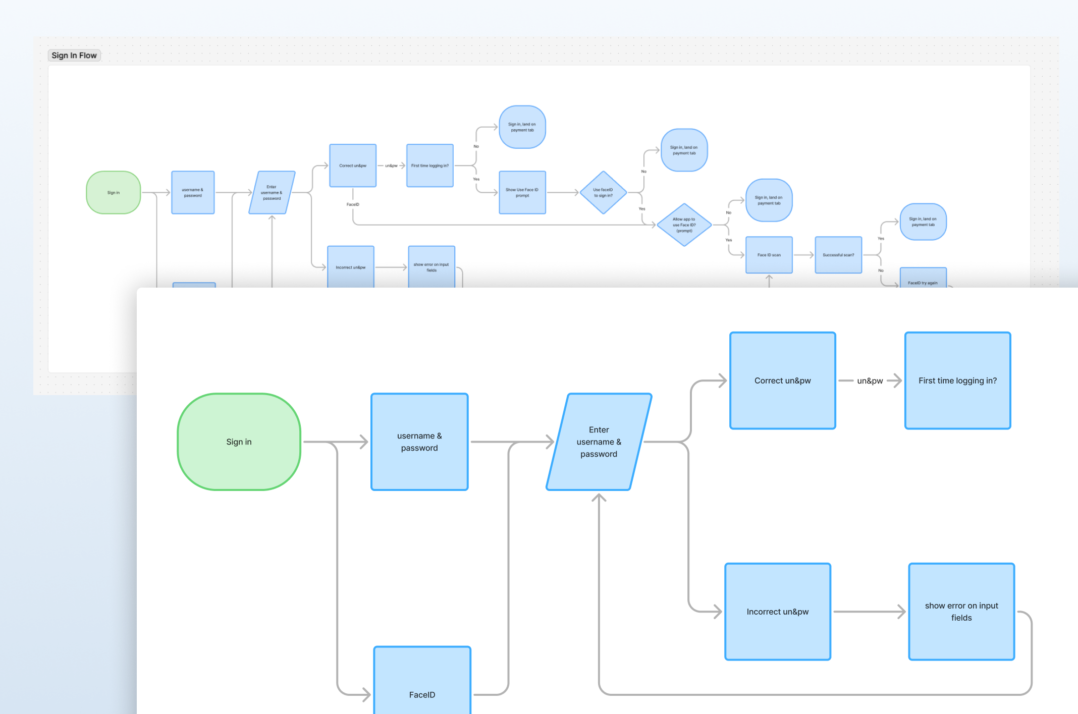
3. Mapping interaction logic
The flowcharts surfaced the system’s complexity. Mapping behavior across payment methods, hybrid flows, and permission states clarified every decision point and ensured the team had a shared understanding of how the app needed to behave.
This phase accomplished:
Defined the logic behind each step, choice, and system response
Clarified how different payment methods interacted with key flows
Outlined how permissions and account context shaped user pathways
Connected hybrid (web + native) components into seamless workflows
Revealed logic gaps that required updates to the sitemap
Designing the experience
With the IA and flow logic established, I focused on designing a seamless experience between web and mobile that felt intuitive, predictable, and aligned with user expectations. I broke down high frequency tasks into clear, guided steps to minimize friction and cognitive load. Every design decision balanced user needs, business priorities, and technical feasibility.
Key design decisions
1. Adapting web flows to mobile-native patterns
I simplified dense desktop flows into clear, mobile-first steps that reduced friction, improved task completion, and maintained familiarity for returning users.
I focused on:
Breaking down multi-step flows into mobile-first steps
Establishing consistent interaction patterns across flows
Preserving familiar terminology and structure
Seamlessly integrating hybrid components (web + native)
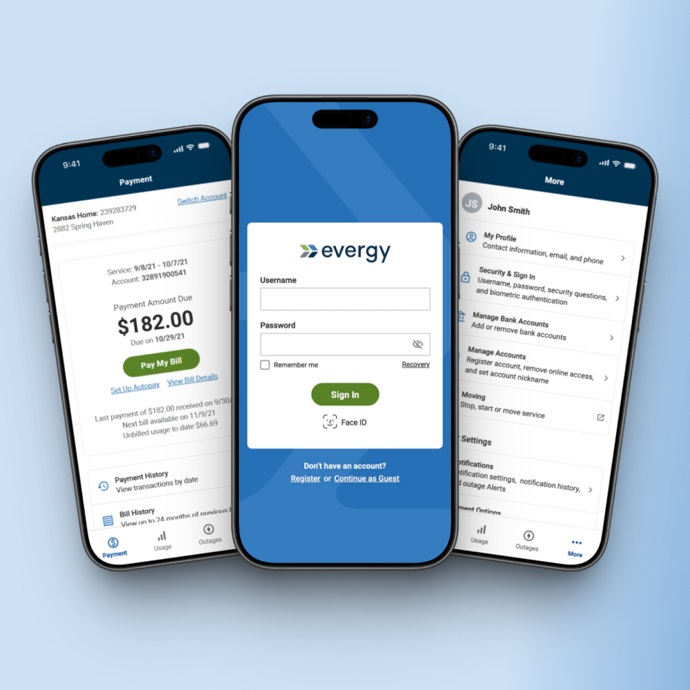
2. Designing a scalable account context selector
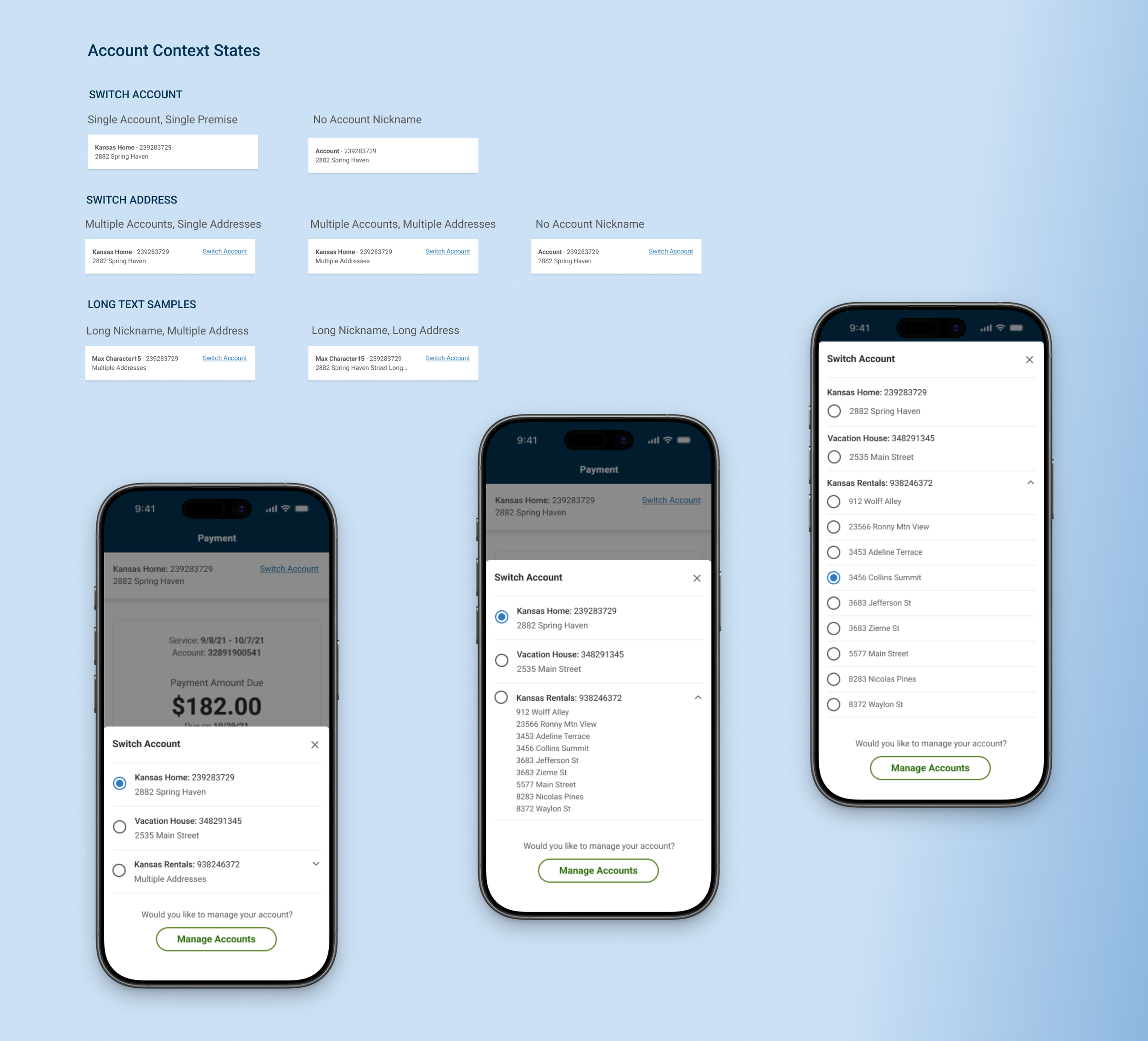
I created a predictable, scalable context selector that made account and property switching clear for all user types, reducing the risk of paying the wrong bill or reporting an outage for the wrong address.
I focused on:
Making account context unmistakably clear with persistent labels
Designing a model that scaled from single accounts to multi-property
Defining its visibility rules to keep users oriented and reduce errors
Ensuring downstream flows behaved correctly after a context change
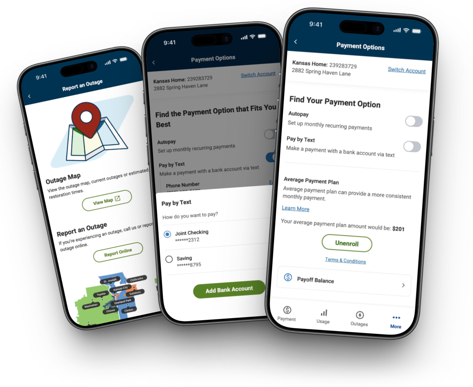
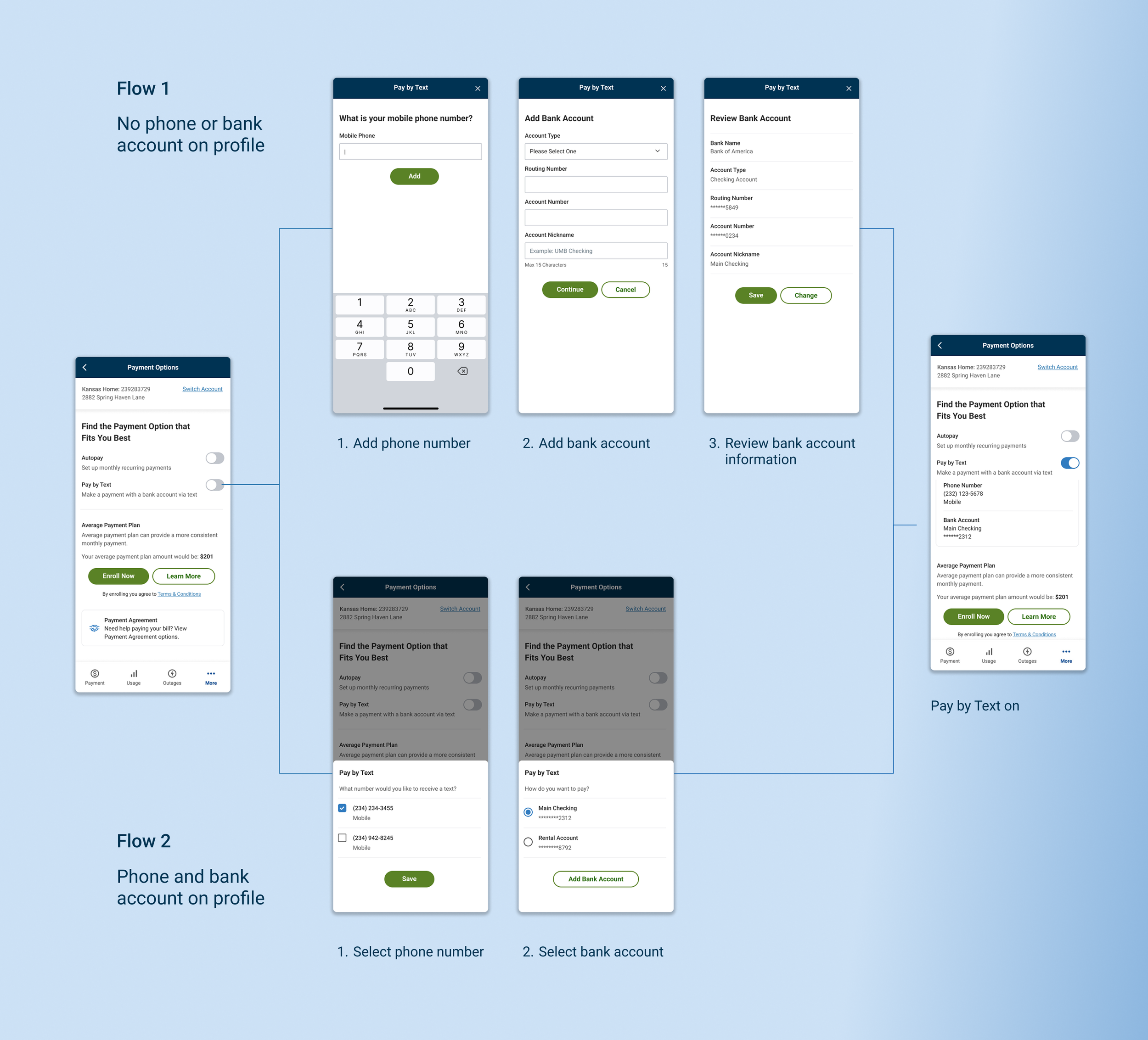
3. Designing an end-to-end mobile payment experience
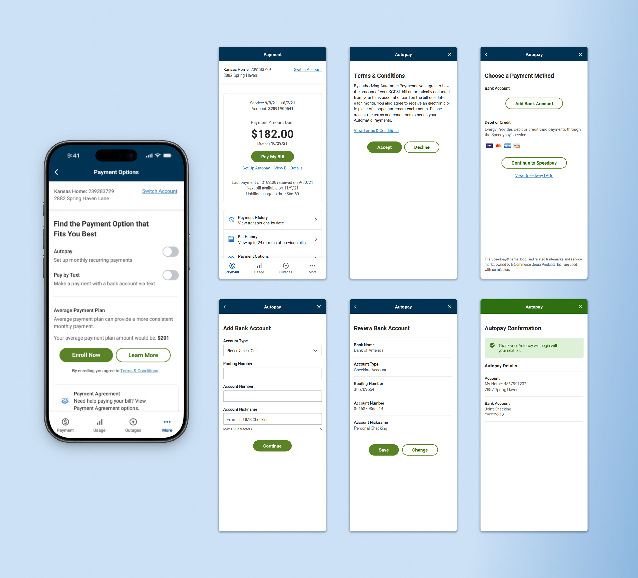
I designed a mobile payment flow that supported multiple payment methods, validation rules, and hybrid components while keeping the experience predictable and easy to complete for both guest and authenticated users.
I focused on:
Mapping payment logic across guest and authenticated states
Allowing users to add/update payment methods without losing progress
Designing clear, actionable validation and error states
Ensuring hybrid components behaved predictably within flows
4. Unifying guest and authenticated outage reporting
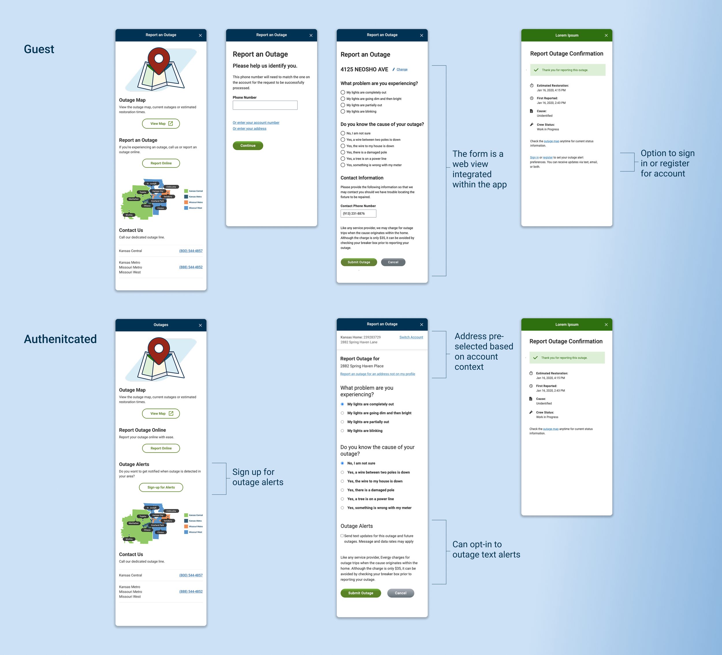
I designed an outage reporting flow that made submitting an outage and tracking its status clear and accessible for both guest and authenticated users.
I focused on:
Supporting both guest and authenticated outage reporting
Mapping how account context shaped available outage actions
Making real-time status and notification signup easy to access
Seamlessly integrating the web-based outage map into the flows
Results & impact
As the sole designer, I was responsible for ensuring the app worked as a complete system, not just a collection of features. By addressing complexity early, the final product shipped as a production-ready mobile experience that improved self-service, reduced operational friction, and gave Evergy a durable foundation for future growth.
Higher mobile adoption following launch: driven by a clearer, more intuitive experience that enabled customers to complete high-frequency tasks independently.
Reduced confusion during billing and account switching: particularly for multi-account customers, through clearer hierarchy, context awareness, and predictable navigation behavior.
Customer impact
Increased self-service completion of billing and account tasks: allowing more customers to successfully resolve actions independently without contacting support.
Future-proofed the platform with a scalable IA and navigation model: creating a foundation that supports current features while enabling expansion across account types and capabilities.
Business impact
Improved cross-team alignment: clearer IA, flows, and documentation created shared understanding across product, engineering, and stakeholders, reducing ambiguity during planning and development.
Reduced development churn: well defined patterns, annotations, and interaction models enabled smoother delivery and fewer revisions during build.
Team impact
Relfection
This work mattered to me because I owned it from beginning to end. I designed every screen, flow, and interaction, and I was responsible for shaping the system that allowed the app to function as a cohesive whole.
Translating a large web ecosystem into a native mobile experience required intentional information architecture planning. The sitemap became the primary artifact for aligning requirements, dependencies, and long-term scalability, establishing a structure the team could consistently rely on.
Close collaboration with the Solutions Architect was central to the project’s success. By validating logic early, testing constraints, and aligning before broader stakeholder review, we reduced uncertainty and avoided potential rework. That shared ownership strengthened both delivery and system integrity.
If I were to extend this project, I would focus on validation around core flows. Usability testing on wireframes would have surfaced friction earlier, while post launch analytics focused on payment adoption, drop-off patterns, and hybrid flow usage would guide future optimization.
Overall, this project reinforced how I run complex work: plan deliberately, make decisions with incomplete information, and align design, engineering, and stakeholders around a clear system direction.